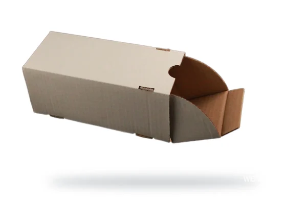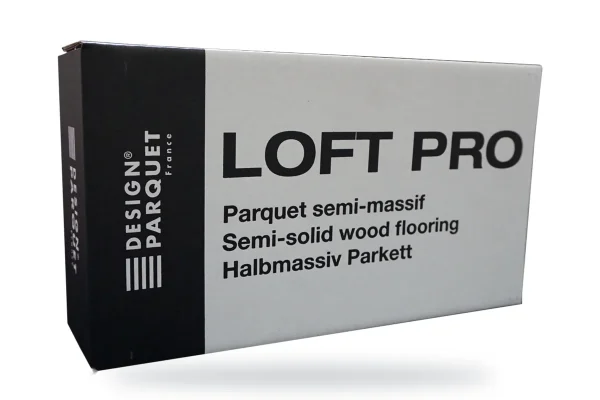

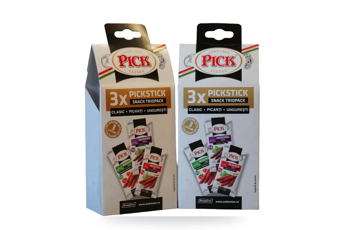
Packaging colours are among the first things a buyer notices. In this article you will see what the main colours communicate, how to choose them for your product and what you need to know about printing on corrugated board.
Why does the packaging matter before the product?
Packaging is the most tangible part of a brand. Customers see it and touch it before they use the product.
On the shelf, competition is tough. Buyers decide quickly and easily pass over products that do not catch their eye. If the packaging does not stand out, the product loses its chance of being chosen.
The same applies in B2B and in e-commerce. The box your goods arrive in is the first physical contact with your company.
What role do packaging colours play?
Alongside brand identity and graphics, colour has several roles:
- it catches the eye on the shelf or when the parcel is opened;
- it represents the product and the category it belongs to;
- it conveys basic information quickly;
- it makes the brand easy to recognise at the next purchase.
A well-chosen colour supports the product's message. The wrong colour can convey exactly the opposite and cost you sales.
What does each colour communicate on packaging?
The associations below are widely used in packaging design. They are not fixed rules, but they help with a first choice.
- Green – natural, organic, eco-friendly products.
- Black – luxury, elegance; it also suits technical or high-tech products.
- Gold and silver – premium products, gifts.
- White – cleanliness, simplicity, purity.
- Primary colours (red, yellow, blue) – energy, play; often used for children's products.
Context matters. The same shade can work differently in different product categories or in different markets.
How do you choose packaging colours for your product?
Start from what you want the product to communicate, not from personal taste. A few useful questions:
- Who buys the product and where do they first see it?
- What colours do competitors in the same category use?
- What colours are already part of your brand's visual identity?
- Should the packaging stand out or fit into a product range?
The answers help you decide whether to follow the category's codes or set yourself clearly apart. Both approaches can work, as long as the choice is deliberate.
How are colours printed on corrugated board?
Corrugated boxes are often printed with flexographic printing (flexo printing), directly on the board. It is a suitable method for logos, text, graphic elements and solid colours.
A few things to know before you finalise the artwork:
- the colour of the base board (kraft or white) affects how the ink looks;
- simple, high-contrast graphics reproduce more clearly on corrugated board;
- the number of colours affects the cost and complexity of the job.
Before production, check the artwork on a mock-up or a sample. That way you see how the colours look on the real material, not just on screen.
The WEPADI team offers graphic design and packaging design. We can help you adapt your brand colours to the material and the type of box you choose.
Conclusion: choose colour with a clear purpose
Packaging colour shapes how customers perceive the product from the very first contact. Choose shades based on your audience, your category and your brand. For boxes printed in your company colours, send us a quote request and get a reply within 24 hours.